
COURSE PROFILE / 03
Research in Public Relations
PREL · 310
Course Approach
Course designed to make students more comfortable with analyzing data they will come across in Public Relations. Many students in the major are writers or comms double majors, and assume that anything dealing with ‘data’ is STEM and beyond them.
Oftentimes students will discuss data as a term that stands-alone with one meaning. The course is a structured walkthrough of how these pieces of data are created, from the ideation of a campus problem (research problem) to assembling populations to work on (sampling) to actual data extraction (focus group and survey instrument) to analysis (data visualization).
Students also get introduced to different aspects of PR outside of the typical event planner, social media manager, to more data or research intensive jobs like focus group moderator, insights manager, or more data engineering type roles. They also understand the creation of data sets and transcription, cleaning data, and how to interpret data in meetings. Students should emerge with a healthy skepticism of simply ‘following the numbers’ while also grounding intuition and ‘vibes’ in data-informed decisions.


Signature Work–Survey & Focus Group
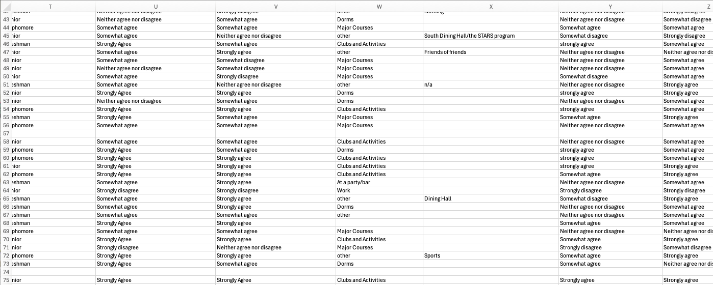
Students developed data visualizations so that when they go on the job market they can be creatives who can also operate in a data-driven economy. The biggest insight they get form the class is having quantification back up insights they have into their own campus community, but this is the project that they can slide into a portfolio or across an interview table and talk about what they found.
Choosing a campus issue that is close to them helps grow confidence but also allows a sense of mastery to accrue for when they talk about these projects. They walk out of the class being able to create and distribute surveys (while also being able to act on those), and running focus groups. Students also have an understanding of semi-structured interviews and how to use different ranges of data (algorithmic, mass, group, individual) to understand the world around them.
Recent iterations I have tried to move more towards the visualization aspect, as having it would improve the portfolio item for students. However, time is usually cramped. I tried to get around this issue by having Datacamp lessons on R Studio run parallel to the class, but initial feedback suggests that this was too steep a hill to climb. Many students are in humanities majors because they want to focus on qualitative experience, and not statistics. Still–the profession has moved increasingly this way, so to ignore it seems like malpractice. Adding in some less intensive data viz, or dashboards like in Tableau might be the way to get around this issue (or–admit defeat and stay in Excel).
COURSE EVIDENCE
Syllabus · Slides: Research Stacks — Chapter One · Slides: Focus Groups

in THE AGENCY · ◎ THE STRAND · ◎ ENGLISH DEPARTMENT · ☁ BLUESKY · ✉ EMAIL